Sarah Mahlab, Canopy
I have always loved maps. They are visually compelling, can make massive amounts of data digestible and, most of all, allow me to orient myself within a place or community. Online maps take my appreciation to the next level – the ability to interact with specific places by zooming-in, or switch from street view to satellite view enable us to do and learn so much more. Maps are no longer just a tool to get us get from Point A to Point B.
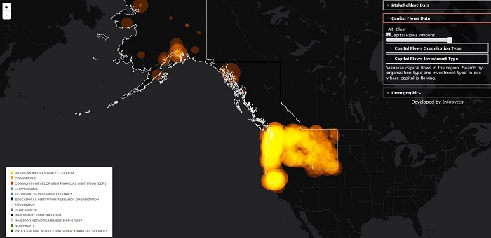
As an organization focused on place, it seemed natural for Canopy to build a map for the benefit of regional communities. Over the past six months, we have collected data on regional stakeholders and capital flows to build an investment map for the Pacific Northwest: a tool that we affectionately refer to as “The Map."
The Map
The Map is a new visualization tool that will allow you to better understand our regional economy. It is your go-to source for information on players and capital at work in your community – and a missing link that will help communities better tell their stories. Consider it the “Zillow of place-based investing”.
Canopy’s map is unique in that it allows users to overlay three distinct layers and adjust transparency on these layers to better understand how they relate to one another. These layers include:
- Stakeholders: We included “pins” on the map to represent various types of organizations at work in our regional economy. You can quickly see, for example, investment priorities by asset class, investment type, industry and impact theme. Click on individual pins to find more information on a particular organization and its geographic focus.
- Capital Flows: We took capital flows data from the 2016 Pacific Northwest Capital Scan and created a heat map. You can now easily visualize where capital is flowing and where it is not. Sort capital flows by capital type and investor type to gain further insights. See the full report here.
- Demographics: We included key demographic datasets that serve as indicators for regional economic health. Overlay this data (and adjust the transparency) to see if capital is flowing to the areas of greatest need.
How is Canopy using The Map?
The information contained in the map is informing Canopy’s strategic direction. First, we are including investment fund managers and entrepreneurs identified on The Map in our online Regional Investment Pipeline. Investors can subscribe to the pipeline to access detailed information about investment opportunities in the region. Second, The Map surfaces major capital gaps in our regional economy – gaps which Canopy seeks to address. We are using our Fund Accelerator, Fund Resource Library, and Consulting Services to work on incubating new collaborative funding mechanisms aimed at closing these gaps.
We hope you will use, share and enjoy The Map. And, that it will support you as you explore new partnerships, find investment opportunities in the region and talk about your work in the context of the ecosystem. If you like what you see, there are four ways for you to get more involved:
- Not on The Map? If you don’t see your organization represented, complete our brief survey.
- Want to stand out? We can feature your organization on The Map.
- Want a map of your own? We can customize The Map to represent geographies and data relevant to your organization. We can embed it on your website and modify colors to match your brand.
- Want to support our work? Organizations that believe in the democratization of regional investment information can sponsor The Map. Curating the massive data behind The Map and keeping it relevant not only takes a great deal of time and care, but it also requires subscriptions to several proprietary datasets. If you or your organization would like to support this public-good, please contact us.
Visit The Map to learn more about our region. The Map is now publicly available on our website. If you share my love for maps — and even if you don’t — we hope you will find this tool both visually compelling and informative. Happy trails!
Sarah Mahlab is associate director of innovation and investments for Canopy, a Pacific Northwest collaboration of stakeholders, including leaders from Laird Norton Family Foundation, Meyer Memorial Trust, Seattle Foundation and The Russell Family Foundation, identifying opportunities to build a regional investment ecosystem that benefits communities and creates financial returns. This article originally appeared on Canopy's blog.